Service Dependency Graph for Safer AI-Assisted Code Changes

A service dependency graph stops you from treating an AI edit like a local change when it is anything but. In multi-module codebases, the break usually lands later: a schema mismatch, a consumer you forgot, a deploy order problem.
What matters is not a prettier diagram. You need to see which services, contracts, and jobs move when you touch one interface (and which ones definitely don't). Start here:
- Find downstream consumers before you accept a "safe" cleanup.
- Separate import edges from runtime and schema edges.
- Check blast radius early, and you ship with fewer surprises.
The Problem AI Assistants Cannot See
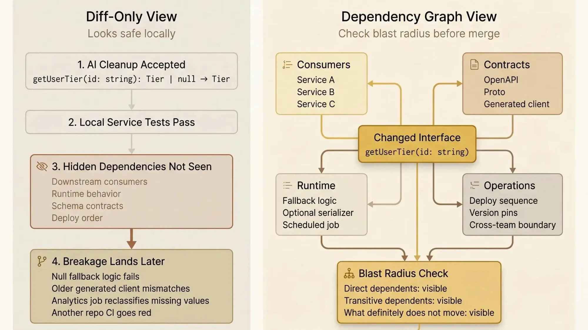
You accept an AI cleanup in a pull request. The diff looks fine. Tests pass in the service you touched. Later that afternoon, another team’s pipeline goes red because a nullable return type became non-null, and five downstream services still have null checks wired into fallback logic.
That failure pattern is common because most assistants are staring at changed lines, not the dependency chain behind them. They can improve a function and still make the system worse. In a small repo, you can sometimes hold that risk in your head. In a multi-service backend, you can’t.
A concrete example:
// beforeexport function getUserTier(id: string): Tier | null// afterexport function getUserTier(id: string): TierLocally, that can look like a nice cleanup. Downstream, it can break:
- null guards that trigger free-tier defaults
- branch logic that treats
nullas "user not provisioned" - API serializers expecting an optional field
- generated client code built from an older contract
- analytics jobs that classify missing values differently
The ugly part is timing. Hidden breakage often appears hours or days later in another repo’s CI, or in a scheduled job, or in a deploy sequence your assistant never saw.
You want AI speed. You do not want blind edits in a codebase too large to keep in one head.
Most AI code review tools catch problems after they ship. For dependency-heavy systems, that’s backwards.

What a Service Dependency Graph Actually Is
A service dependency graph is a structured map of how services, packages, APIs, schemas, jobs, and supporting infrastructure depend on one another. It shows direct relationships and transitive ones, so you can reason about blast radius before a change lands.
That sounds simple. It isn’t, unless the graph is built from real code and real contracts.
A useful graph includes:
- service-to-service calls
- shared library imports
- schema dependencies such as proto files and OpenAPI specs
- database or infrastructure relationships when they affect runtime behavior or deploy order
- version relationships when consumers are pinned to different releases
This is not just an onboarding diagram. It is not a package tree. It is not a README someone updated three quarters ago and forgot. And it is definitely not just a list of imports.
For AI-assisted development, the graph matters because it gives the model architectural truth instead of asking it to guess from partial context. That changes the quality of the interaction. You stop asking vague questions like "is this safe?" and start asking "which downstream consumers rely on this interface, and which are pinned to an older schema?"
The stronger implementations go one step past service edges. They connect symbols, files, interfaces, call sites, and architecture boundaries. At that point, the graph stops being a static picture and becomes queryable context. That’s the difference between a poster on the wall and something an assistant can actually reason over.
Why Diff-Only Context Breaks Down in Multi-Service Codebases
Diff-only review works when the change is local. Most backend changes aren’t local.
A narrow diff can improve code style, simplify a method, or remove duplication. It can also miss cross-file dependency chains, breaking signature changes across repos, framework conventions, and runtime dependencies that never appear in the changed file.
We see the same failure classes over and over:
- A shared library change passes its own CI because consumer pipelines run elsewhere.
- An assistant suggests direct instantiation in a codebase that relies on constructor-based dependency injection across 200+ service classes.
- A schema edit compiles in the source service, but downstream clients need regeneration before anything is actually safe.
That last one catches teams constantly. The source repo is green. The system is not.
Backend teams already pay a coordination tax in microservices and cloud-native setups. Every split repo, every generated client, every package version adds another place where "looks fine here" can still mean "breaks there." The model doesn’t need more faith from you. It needs context it can act on.
Safer AI-assisted development is not about trusting the assistant more. It’s about giving the assistant repository-aware and service-aware context before it suggests or applies changes.
What a Useful Service Dependency Graph Needs to Capture
If you want the graph to help with real changes, not just architecture reviews, it needs multiple layers. One layer is never enough.
The layers that matter
- Service-level edges: who calls whom, which jobs feed which services, where requests flow.
- Package and module dependencies: shared libraries, internal packages, workspace modules.
- Symbol-level usages: exported functions, types, interfaces, and where they are consumed.
- Schema and contract dependencies: proto, OpenAPI, event schemas, generated clients.
- Infrastructure relationships: deployment ordering, module references, runtime wiring.
Direct impact is the consumer that uses the changed thing. Indirect impact is everyone downstream of that consumer. Teams often stop at direct dependents because that list is easier to read. That’s how they miss the second-hop break that shows up on Friday.
Useful graphs also classify dependencies:
- runtime vs compile-time
- internal vs external
- stable vs risky hotspots
- version-pinned vs floating consumers
For AI coding assistants, a few capabilities matter more than pretty rendering:
- Upstream and downstream traversal
- Blast radius analysis
- Boundary awareness across domains or teams
- Existing code discovery, so the assistant can find the right pattern before inventing a new one
- Dead code signals, so it doesn’t preserve stale paths or cargo-cult old logic
One hard-earned point here: a pretty graph with weak edges creates false confidence. We’d take a smaller graph built from actual artifacts over a giant visual assembled from guesses every time.
How to Visualize Service Dependencies Without Creating a Pretty but Useless Diagram
If you’re asking how to visualize service dependencies, start from developer questions, not presentation needs. Most topology diagrams fail because they optimize for the architecture meeting, not the person about to change shared code.
The views that actually help are narrower and more query-driven.
Views worth having
- System-wide service topology mapping for orientation
- A focused backend service relationship map centered on one service or package
- An upstream and downstream services view for blast radius
- A transitive path view that shows ripple effects across multiple hops
- A hotspot view for unusually high fan-in, cross-domain dependencies, or cycles
Those views should expose more than boxes and arrows:
- dependency direction
- dependency type
- cross-domain edges
- version mismatches
- cycles
- ownership or team boundaries, if you have them
A useful output might look like this:
Target: billing-profile-serviceDirect dependents: 23Domains affected: 5Changed files: 3Blast radius: 14 filesCross-domain edges: 2Pinned consumers on v1 schema: 4That tells you something. A wall-sized map usually doesn’t.
Microservice dependency visualization needs breadth and drill-down depth at the same time. You want the whole system when orienting. You want one service, one contract, one symbol when making a change. Good tools let you zoom from service level into file or symbol level without losing the path between them.
Default to query-first. Ask:
- What depends on this service?
- What breaks if I change this interface?
- Which consumers need to migrate first?
If the graph can’t answer those quickly, it’s decoration.
How to Build the Graph From Real Source Artifacts
A service dependency graph is only as trustworthy as the inputs used to build it. Hand-maintained maps rot fast. Static docs drift. Generic diagrams flatten everything into the same kind of edge and hide the point.
Build from artifacts the codebase already keeps current:
- Go module files for import and module relationships
- JavaScript and TypeScript package manifests
- Python dependency files
- proto imports for gRPC relationships
- OpenAPI definitions for contract links
- Terraform module references for infrastructure dependencies
- framework-specific wiring signals like dependency injection, where they affect runtime behavior
Multi-repo teams need artifact-driven graph construction even more than monorepo teams. A monorepo at least gives you a chance of catching some breaks in one CI run. In multi-repo systems, breakage can stay hidden until another service builds, deploys, or regenerates clients. That delay is where bad AI edits look harmless.
The graph also has to update from source changes and Git diffs. Otherwise it won’t help where it matters: pre-push checks, PR review, and refactoring work. If it refreshes weekly, it’s already stale.
One practical way to do this is with a knowledge graph built from code and architecture artifacts. Pharaoh approaches it that way so AI assistants can query dependencies, blast radius, existing code, and dead code through MCP before making changes. That’s useful if you’re already working in Claude Code, Cursor, Codex, or another MCP client.
Why Graph-Based Context Works Better Than Bigger Prompts
A fair question is: why not just give the assistant more files, or even the whole repo?
Because more raw code does not guarantee better reasoning. Large context windows help, but they don’t tell the model what matters. Structure matters.
A graph-based approach does two things better than brute-force prompting:
- retrieves the exact upstream, downstream, and contract context tied to the change
- reduces prompt noise, so the assistant spends tokens on relevant relationships instead of unrelated code
The research is lining up with what teams feel in practice. Graph-based summarization has reached 82% retrieval accuracy for code context. Knowledge graph approaches have shown a 21.33% improvement in code navigation. Code property graph methods have reduced code size by 67.84% to 90.93% while keeping security-relevant context intact.
For developers, that translates to:
- better retrieval of the right files and symbols
- fewer 40K-token prompt dumps when 2K tokens of targeted context would do
- clearer reasoning about boundaries and transitive effects
The goal isn’t to stuff everything into the prompt. It’s to route the assistant to the exact context the change depends on.
That’s a calmer way to work. And usually a faster one.
Where a Service Dependency Graph Changes Daily Developer Work
This gets real in ordinary workflows, not architecture theory.
Before editing shared code, the graph helps you find every service, repo, or symbol that consumes the target. You can separate direct from indirect impact and check whether the change is breaking for contracts, schemas, or versions. That’s the difference between "looks local" and "actually local."
During a Claude Code, Cursor, or Codex session, the graph sharpens the questions:
- Which services depend on this module?
- Where does this pattern already exist in the codebase?
- Which dead code paths or duplicate implementations make this change look simpler than it is?
Those are better prompts because they’re grounded in the system you actually have.
In PR review, a graph lets you verify that the assistant’s suggestion respects architecture boundaries and downstream expectations before merge. That matters for dependency updates too. AI agents are changing packages in real pull requests, and some agent-authored dependency updates select known-vulnerable versions more often than human-authored ones. PR-time dependency and blast radius analysis matters more now, not less. For the linting, testing, and policy side, the open source AI Code Quality Framework is a useful companion.
Refactoring sprints are another place where the graph earns its keep. It tells you whether a change is local, cross-domain, or system-wide. It highlights hotspots with high fan-in, where a "small" edit carries outsized risk. And in multi-repo migration planning, it gives you rollout order based on real dependencies instead of tribal knowledge and a Slack thread from last year.
How to Visualize Upstream and Downstream Services for Safer Changes
If you need to visualize upstream downstream services, don’t start from the whole service. Start from the changed symbol, interface, or schema.
Upstream answers: what does this service rely on, and what assumptions does it inherit?
Downstream answers: who consumes this service, and what breaks if its contract changes?
A practical sequence works well:
- Start from the changed symbol or interface.
- Expand to immediate consumers.
- Expand again to transitive consumers and operational dependencies.
- Label each impact as direct, indirect, schema, or infrastructure.
That view changes real engineering decisions. It tells you whether a change is safe behind the current interface, whether you need a compatibility layer or versioned endpoint, and whether rollout has to be coordinated across teams or repos.
A few examples:
- A shared library rename needs code changes in direct consumers.
- A proto change may require client regeneration without source edits everywhere.
- A Terraform module change may leave code untouched but still affect deployment timing and redeploy order.
This is the payoff. The graph turns "what depends on what" from vague anxiety into an inspectable decision.
Common Mistakes Teams Make With Service Topology Mapping
Most disappointing service topology mapping efforts fail in predictable ways.
Teams treat topology as documentation instead of an operational tool. They build at only one layer, usually services, and ignore symbols and contracts. They miss runtime edges and dependency injection. They collapse all edge types into one line style. They visualize everything and make nothing queryable. Then they keep the graph outside the developer workflow, so nobody checks it before editing.
The result is always some mix of:
- false confidence
- missed breaking changes
- extra noise in AI context
- a graph that looks impressive in review meetings and is absent in daily coding
There’s also a security angle people still underestimate. AI assistants don’t just edit code now. They edit dependencies. If the graph can’t show package relationships, version pins, blast radius, and cross-service consumers during review, you’re leaving a gap open right where the risk moved.
A service dependency graph is not enough on its own. You still need tests, linting, and code review. The graph answers what will be affected. It does not prove the final behavior is correct.
What to Look for in a Tool or Approach
If you’re evaluating a tool or deciding how to build this in-house, keep the checklist simple and brutal.
- Can it build from real source artifacts instead of manual input?
- Can it handle multi-module and multi-repo environments?
- Can it show service-level and symbol-level dependencies?
- Can it visualize upstream and downstream services clearly?
- Can it detect transitive blast radius and cross-domain edges?
- Can it surface existing code patterns and dead code where relevant?
- Can AI assistants query it directly through MCP or something similar?
The tradeoffs are straightforward. Static documentation is easy to start with and easy to stop trusting. Local deterministic analysis can be easier to verify in tightly controlled environments. Knowledge graph approaches are better when the goal is AI-assisted change planning, not just diagram generation.
If you want an MCP-friendly option, Pharaoh is one way to put architecture context in front of an AI assistant without asking the model to infer the whole system from a diff.
Readers aren’t shopping for a buzzword here. You want fewer surprise breakages, faster reviews, and more confidence when changing shared code. That’s the bar.
Conclusion
Safer AI-assisted development comes from better context, not more faith in the model. A service dependency graph makes hidden relationships visible before code changes turn into incidents.
By this point, you should have a clear mental model of what a service dependency graph is, how to visualize service dependencies in a way that supports decisions, why upstream and downstream mapping matters for blast radius, and where graph-based context fits into real AI coding workflows.
The next step is small on purpose. Pick one shared service or library your team touches often. Map its upstream and downstream dependencies from real artifacts. Then use that graph in your next AI-assisted refactor or PR review.
Watch what changes in the conversation.
Usually, the first thing that disappears is guesswork.